

| Hot Spot control | Graph control | |
 Tabbed dialogs enable the use of overlaid dialog "sheets" to be used as multiple entry forms, as shown by this simple example:
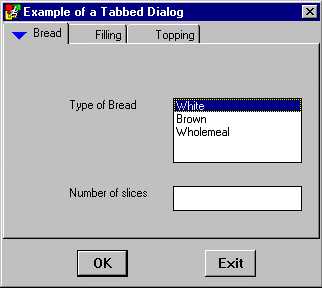
The run time user can press the tabs at the top for Bread, Filling and Topping in order to switch between the three overlaid pages being used here. Controls (buttons, list boxes, etc.,) on pages are created, edited and used in just the same way as with normal dialogs. However, an important difference is that you can set your controls to appear on one tab page, or on the common area outside of the tab pages frame. In this example, the list input control for Bread is just placed on this top page for bread, while the OK and Exit button controls are below the lower extremity the tab control.
 Pressing the browse button on the TabSheets property brings up the Tab Sheet editor. You can Rename, Add and Delete tab pages.
The ActiveSheet property sets which sheet should be the default. That is, which left to right tab should appear in the foreground at run time.
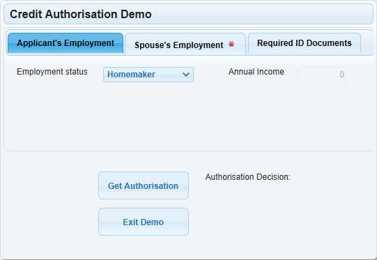
 The default blue marker triangles
  on the tabs at run time are used to alert the user that there are some obligatory items on other tabs that need completion (the color can be changed via the IncompleteColor property on the Knowledge Module Information editor).
ControlType
The ControlType property allows the TabSheet control to appear in different forms at runtime. There is the 'Standard' type which produces a standard TabSheet (horizontal display of tabs, similar to the design time view), there is the 'Accordion' type which produces a vertical display of 'tabs' with only one 'section' open at any one time, and finally there is the 'Panels' type which produces a vertical display of 'tabs' but in this case the 'panels' are stacked vertically allowing mutliple 'panels' to be open at the same time.
The above screenshot shows a sample of the TabSheet control in the dialog editor.
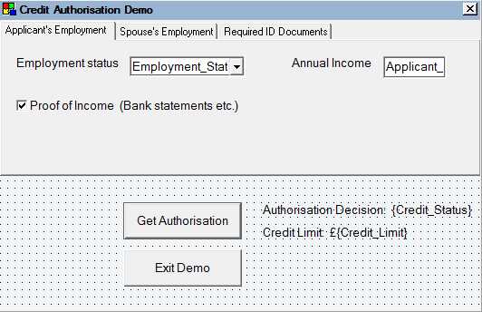
The above screenshot shows the runtime display with the ControlType property set to 'Standard'
The above screenshot shows the runtime display with the ControlType property set to 'Accordion' (the height of the control remains the same as the designed height).
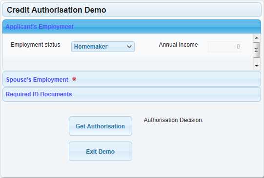
The above screenshot shows the runtime display with the ControlType property set to 'Panels' (the height of the control changes depending on the opened/closed state of the panels).
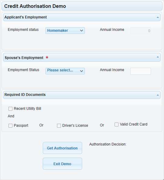
In addition when the ControlType is set to 'Panels' then the Tabsheets property in the dialog editor has more options - each sheet has its own 'Panel Settings';
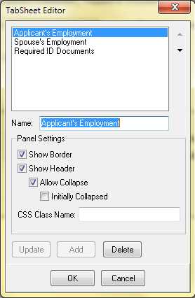
Name: The name for the panel can include html, for example <div class="ui-icon ui-icon-info" style="float:left"></div>Applicant's Employment will produce the header 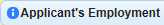
Show Border: Each panel can have its border separately controlled.
Show Header: Each panel can have its header separately controlled.
Allow Collapse: If the header is shown then the panel can be allowed to collapse or not.
Initally Collapsed: If the header is collapsible then the initial state of the panel can be set.
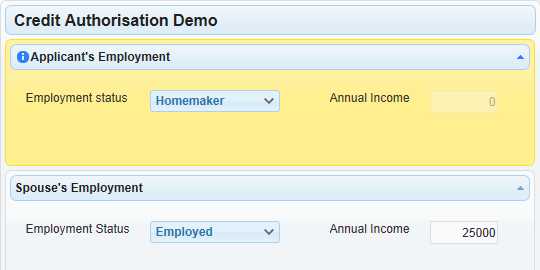
CSS Class Name: A CSS class maybe be specifically assigned to the panel for example ui-state-highlight from the jQuery UI theme will change the colour of 'Applicant's Employment' panel as follows;
The ControlType property for TabSheet controls is only supported in the 'Ajax .Net Web Browser Deployemnt' and the 'Web Browser Deployment' types.